
Stunning &
Responsive Websites For Every Device
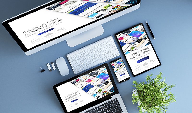
In today's mobile-first world, your website needs to look perfect on screens of all sizes. We design fluid, fast-loading, and highly intuitive responsive websites that drive engagement and conversions.
Flawless Experiences Across All Devices
A responsive website automatically adapts its layout, images, and content to fit the device it's being viewed on — whether it's a desktop, tablet, or smartphone. This ensures a seamless user experience, lowers bounce rates, and boosts your SEO rankings.
Our Responsive
Design Services
Mobile-First Design
We start our design process with mobile users in mind, ensuring fast load times, touch-friendly navigation, and clear calls-to-action on smaller screens.
Cross-Browser Compatibility
Your website will look and function perfectly across all major web browsers including Chrome, Safari, Firefox, and Edge.
SEO-Friendly Architecture
Google prioritizes mobile-friendly websites. Our responsive designs are built with clean code and structured data to help you rank higher in search results.
Ready for a Mobile-Ready Website?
Contact us today to design a website that engages your audience, no matter what device they use.
Book Free Consultation